
Colors Explained
How to make courageous color choices with confidence, and use the psychology of color to create harmony in the space.
INTERIOR TALKS
Jude Idriss
5/30/2024

DISCLAIMER…
Welcome to Interior Talks, a blog where we delve into heartfelt and valuable topics. From insightful knowledgeable tips and how interiors reflect our true selves to discussions on wellness, life, and emotional inspirations, our aim is to aid those on a journey of growth. Everything I write stems from personal experiences and ongoing learning. This blog serves as an open platform for sharing new discoveries and engaging topics that captivate me. My inspiration comes from the world around me, and I'm eager to share it with you. At Interior Talks, we explore the essence of the self within our living spaces. Please note that all content is provided for informational purposes only.
INTRODUCTION
Understanding hues, tones, tints, and shades and their connections is key in interior design. It helps create beautiful, cohesive spaces that evoke the right emotions and serve their purpose well. Here’s a closer look at these color concepts and how to use them effectively in your designs. The first step to color guidance is to learn about the color wheel.It is a tool for exploring color combinations, guiding you to make bold choices with confidence. Let's dive in….
UNDERSTANDING THE COLOR WHEEL:
The color wheel is not just a static diagram but a dynamic tool that empowers you to make courageous and creative color choices. By understanding and utilizing the relationships between colors, you can enhance your designs, making them more visually appealing and impactful. Here is a picture of the color wheel to refer to:
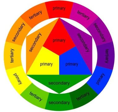
THREE STRUCTURES OF A BASIC COLOR WHEEL:
1) Primary colors: red, blue, and yellow
What are primary colors? They are the foundation of the color wheel and are used to create all colors.
2) Secondary colors: green, purple, and orange
How are they formed? They are the mix of 2 primary colors at equal ratio.
Red and blue = purpl
Blue and yellow = green
Yellow and red = orange
3) Tertiary Colors: Tertiary colors are created by mixing a primary color and a secondary color adjacent to it on the color wheel. The tertiary colors have compound names like red-orange, yellow-orange, yellow-green, blue-green, blue-purple, and red-purple.
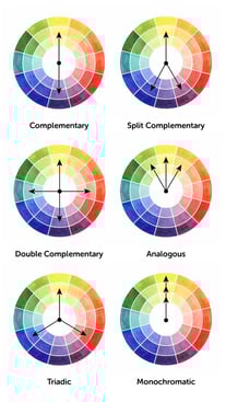
COMBINING COLORS (COLOR RELATIONSHIPS):
This is very useful and important because it gives you a sense of color direction in your design that you will stick by and it will make your design journey more aligned as you always go back to the concept you chose and also empower you to be courageous without feeling hesitant or overwhelmed. Let’s dive deeper into the different categories of color relationships you can use in your space design.
2) Split-Complementary Colors
Split-complementary involves one base color and the two colors adjacent to its complementary color. This provides a similar level of contrast as complementary colors but with less tension.
Examples:
Red with Blue-Green
Blue with Red-Orange
Example Usage: This scheme offers a balanced yet contrasting look, ideal for creating vibrant but harmonious designs. It’s useful for spaces where you want a dynamic look without being too overwhelming. It can also be more balanced by using shades, tints, and tones or use the 60-30-10 rule. (We will discuss this further later in this blog)
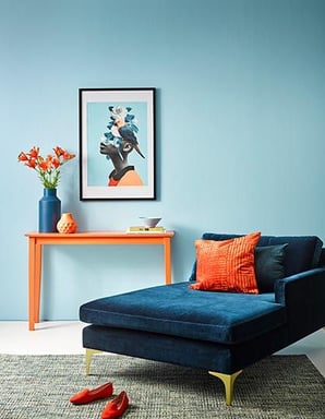
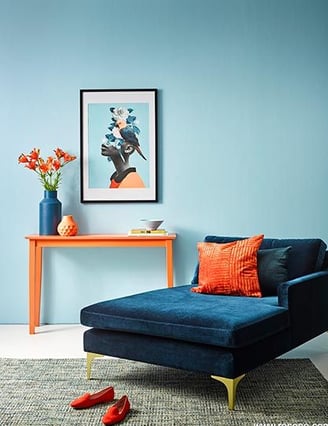
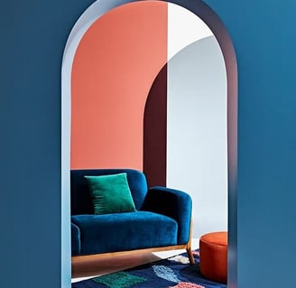
1) Complementary Colors
Complementary colors are opposite each other on the color wheel. Pairing these creates high contrast and a lively, dynamic appearance.
Example Usage: Use complementary colors to make elements stand out. This is great for accents, focal points, and high-impact areas. For example, a blue wall with orange accessories can create a striking effect in a room. If you want to have this contrast to feel more balanced feeling, you can tint, shade or tone the blue wall color. (We will be talking further about hues, tones, tints, and shades , and how to balance complementary colors later in this blog )
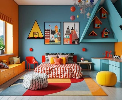
3) Triadic Colors
Triadic color schemes use three colors that are evenly spaced around the color wheel, forming a triangle.
Examples:
Red, Yellow, and Blue
Green, Orange, and Purple
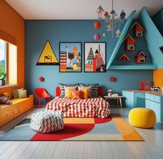
Example Usage: Triadic schemes are vibrant and offer strong visual contrast while retaining balance and harmony. They are excellent for lively and colorful designs, such as in children’s playrooms or eclectic living spaces.
4) Tetradic (Double-Complementary) Colors
Tetradic color schemes involve four colors, in the form of two complementary pairs.
Examples:
Red and Green with Blue and Orange
Yellow and Purple with Red and Green
Usage: Tetradic schemes provide plenty of opportunities for varied color combinations and rich, complex designs. They are suitable for creating diverse and vibrant environments, but they require careful balance to avoid visual overload. Using one of the balancing methods can help create a less overwhelming space. ( We will discuss different balancing colors methods later in this blog )
5)Analogous Colors with Accents
While analogous colors (colors next to each other on the color wheel) are harmonious, You can add an accent color from the opposite side of the wheel to create contrast.
Examples:
Blue, Blue-Green, Green with orange accent
Red, Red-Orange, Orange with blue accent
Usage: This approach maintains harmony while introducing a pop of contrast. It’s useful for creating a balanced yet dynamic design, where the accent color can highlight specific features.
6)Monochromatic Colors
Definition: Different shades, tints, and tones of a single hue.
Examples:
Various shades and tints of blue.
Usage: Use a monochromatic scheme to create depth and dimension with varying shades and tints. In a bedroom, you might use light gray walls, medium gray bedding, and dark gray accents for a sophisticated, layered look.
COLOR PSYCHOLOGY: UNDERSTANDING COLOR THEORY CONCEPTS:
Color psychology is the study of how colors affect human behavior, emotions, and perceptions. Different colors can evoke various psychological responses.
Warm and Cool Colors:
Warm Colors: Include reds, oranges, and yellows. These colors tend to make spaces feel cozy and inviting.
Cool Colors: Include blues, greens, and purples. These colors are calming and can make a space feel larger and more open.
Red: Often associated with passion, energy, and excitement. It can also evoke feelings of urgency or danger.
Blue: Known for its calming and tranquil effects, blue is often associated with trust, security, and professionalism.
Yellow: Bright and cheerful, yellow is often associated with happiness, optimism, and creativity. However, too much yellow can evoke feelings of anxiety or caution.
Green: Linked to nature, growth, and harmony, green often conveys a sense of freshness, balance, and stability.
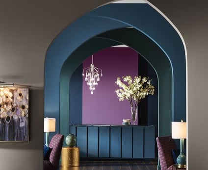
Purple: Historically associated with royalty and luxury, purple can evoke feelings of sophistication, creativity, and spirituality.
Orange: Vibrant and energetic, orange is often associated with enthusiasm, warmth, and creativity.
Pink: Often associated with femininity and sweetness, pink can evoke feelings of nurture, compassion, and sensitivity.
Black: Symbolizing power, elegance, and sophistication, black is often used to convey authority and formality.
White: Representing purity, simplicity, and cleanliness, white can evoke feelings of clarity, innocence, and spaciousness.
Gray: Conveys neutrality, practicality, and sophistication. It can evoke feelings of stability and maturity.
BALANCING COMPLEMENTARY COLORS COMBINATIONS:
Balancing complementary color combinations involves careful consideration to ensure that the colors enhance rather than overwhelm each other. Here are some strategies to achieve a harmonious and visually appealing balance:
1) Vary the Tints, Shades and Tones
Instead of using pure hues, use different shades, tints, and tones of the complementary colors:
Hues
Definition: Hue refers to the pure color in the color spectrum, essentially the color's origin. It's the attribute of color by which it is discernible as red, blue, green, etc.
Examples: Red, blue, yellow, green.
Usage: Hues are used to identify the base color family and are the starting point for creating tints, shades, and tones.
Tints
Definition: A tint is created by adding white to a hue, making it lighter.
Examples: Adding white to blue creates light blue; adding white to red creates pink.
Usage: Tints are often used to create softer, pastel colors that can make a space feel lighter and more open.
Shades
Definition: A shade is created by adding black to a hue, making it darker.
Examples: Adding black to blue creates navy; adding black to red creates maroon.
Usage: Shades are used to create deeper, more intense colors that can add richness and depth to a space.
Tones
Definition: A tone is created by adding gray (a mix of black and white) to a hue, which can either lighten or darken the color while reducing its intensity.
Examples: Adding gray to blue creates slate; adding gray to red creates a muted red.
Usage: Tones are used to create more complex and subtle variations of color, often giving a sophisticated, subdued look.
2) Incorporate Neutrals
Neutral colors like white, gray, beige, black, or wood help to soften the intensity of complementary colors and provide a visual break.
Example: Blue and orange with white trim, gray upholstery, or beige rugs to create a calm backdrop that balances the vibrancy.
3)Texture and Patterns
Introduce texture and patterns to break up solid blocks of color and add visual interest:
Textures: Use different materials like velvet, linen, wood, or metal.
Patterns: Incorporate patterns that combine the complementary colors in subtle ways.
Example: Mustard leather sofa with purple patterned cushions, or a rug that incorporates both colors in a geometric design.
4)Use the 60-30-10 Rule
This rule helps to distribute colors in a balanced way:
60%: Dominant Color (the main color in the room)
30%: Secondary Color (the complementary color)
10%: Accent Color (a third color to add interest)
Example:
60% Neutral: Walls and large furniture pieces
30% Shades of green : Curtains, cushions, and smaller furniture
10% Animal Prints or Another Accent Color: Accessories, such as vases or artwork
5) 80-20 Rule - Minimalistic (Pareto Principle)
Proportions: Use 80% of a dominant color and 20% of an accent color.
Application: This principle can be particularly effective in minimalist designs where a strong, clean look is desired, and the accent color is used to draw attention to specific elements.
6) Rule of Thirds
Proportions: While traditionally used in visual composition and photography, the rule of thirds can be applied to color by dividing the space into three equal parts and using one part for the dominant color, one part for the secondary color, and one part for accent colors.
Application: This method encourages a dynamic and balanced distribution of colors, avoiding symmetry and creating visual interest.

CONTACT
info@judeidrissinteriors.com
Montreal, Canada
Ottawa, Ontario